Replay your network, hour by hour
Event mobility and network capacity planning on an AI-native map. Watch a crowd build toward kickoff, flows route in over real streets, and per-sector cell load climb to congestion.
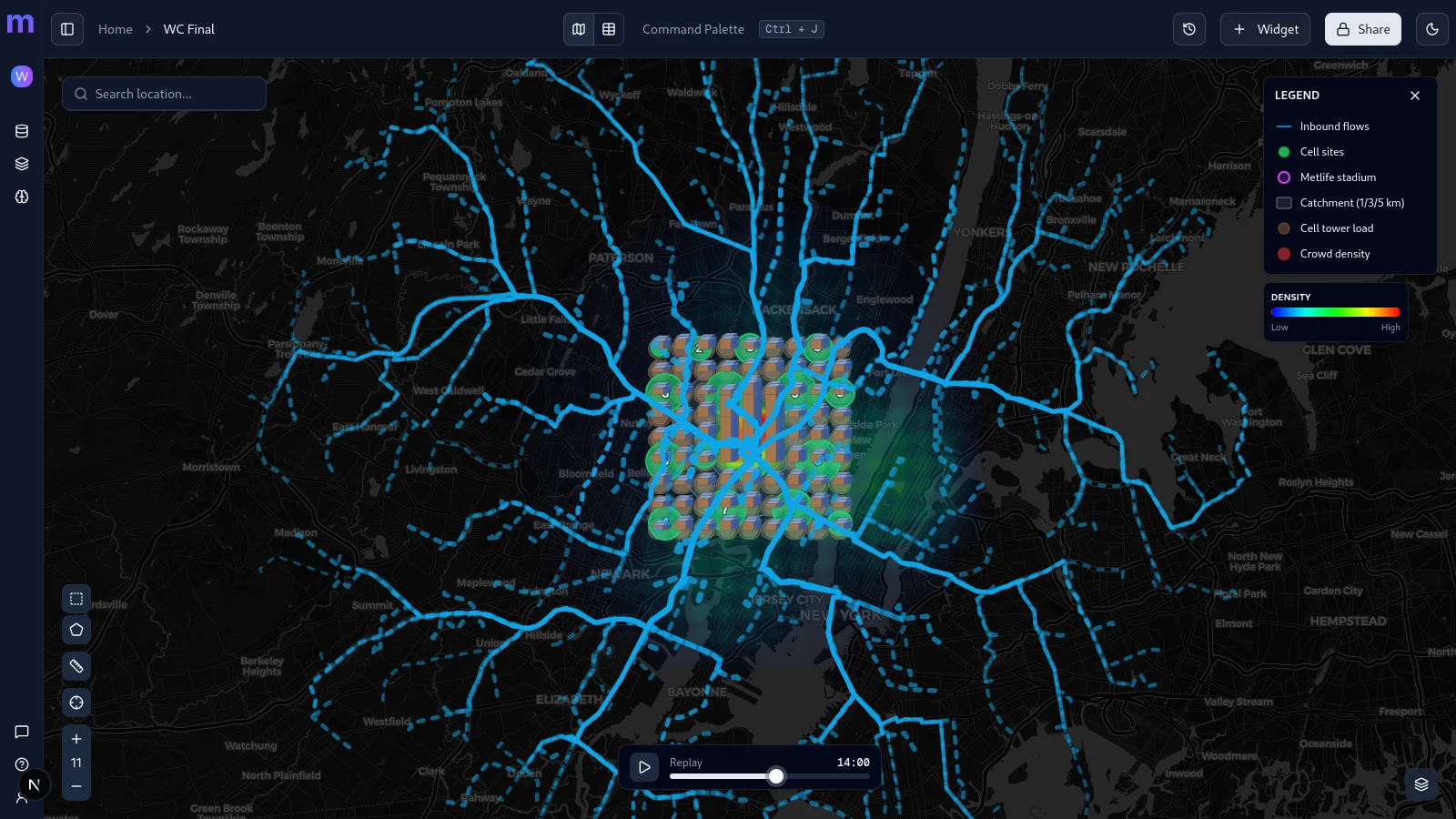
What you are looking at
One map, six layers, all moving on the same clock. Here is how to read the frame above.
Crowd density
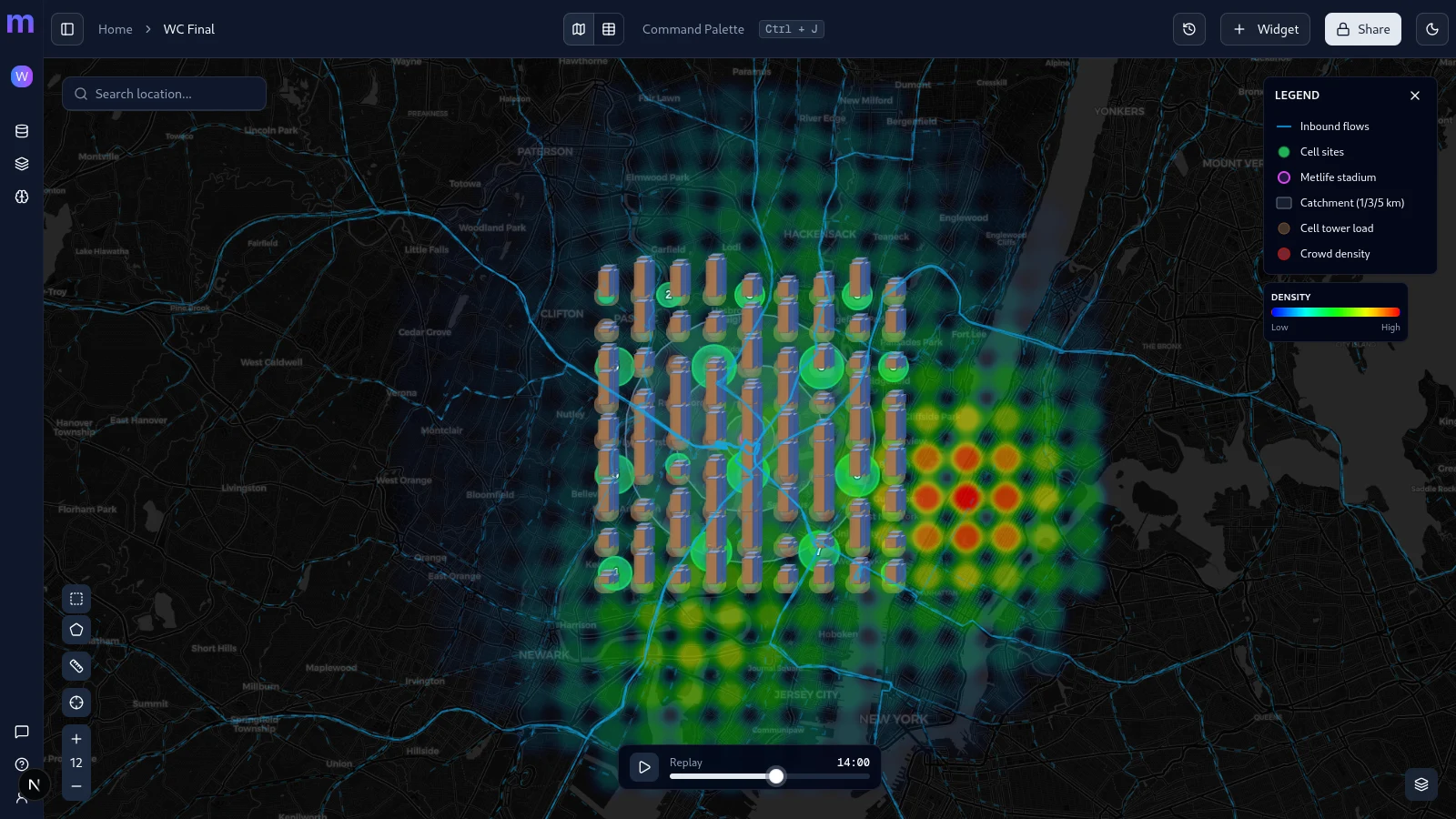
Aggregated subscriber density. The warm bloom is the crowd building on the stadium; the cooler field is the resident metro baseline.
Inbound flows
Origin-to-venue subscriber routes, snapped to the real road network. Brighter and thicker means more people travelling that hour.
Cell tower load
One bar per sector, height = PRB utilization. Venue-facing sectors rise to congestion while their back-sectors stay short.
Cell sites
Physical macro towers. Each carries three sectors at 120-degree spacing, so a busy site shows one tall bar and two low ones.
MetLife Stadium
The event venue - the sink every inbound flow routes toward and the centre of the demand.
Catchment rings
1 / 3 / 5 km bands around the venue for instant distance context on where load and crowd sit.
Built for network planning
The most visual, time-aware use case in telecom - the questions are always where and when, and only a map answers them.
Hour-by-hour replay
Scrub a full event on a time slider - build-up, kickoff, dispersal. Every layer moves together on one timeline.
Street-routed flows
Subscriber origin-to-venue flows routed over the real road network, weighted by volume for each hour.
Per-sector RAN load
Real per-sector PRB utilization, throughput, and headroom - not one made-up metric. Congested sectors light up.
Ask the map
"Explain this hotspot." "Where should we place a temporary cell?" The AI answers on your own data.
The event, hour by hour
Press play and the whole map moves on one clock - a full match day from a quiet morning through kickoff to dispersal. The forecast fires before the congestion does.
- 07:00Quiet
Baseline morning
A normal Sunday metro. Every sector sits well inside its headroom and the bowl is empty.
- 12:00Build-up
Crowds set out
Inbound flows thicken as subscribers travel in from across the metro. The forecast layer already flags the cells that will struggle.
- 15:00Kickoff
Peak load
82,500 people at the venue. Sectors facing the stadium saturate while their back-sectors hold, and the roaming share spikes.
- 18:00Dispersal
Emptying out
Flows reverse and thin; per-sector load drains back toward baseline as the crowd leaves.
Connect the stack you already run
Mappt reads directly from the systems an operator already operates. No new warehouse, no file drops - the map is live against your sources.
Cell-site and sector inventory, routed origin-destination flows, venue and catchment geometry.
Per-sector hourly RAN telemetry - PRB utilization, active users, throughput, headroom, and forecast.
Aggregated crowd density delivered straight from your data-product endpoint. No file exports.
See the crowd before it arrives
Replay the last edition of a marquee event, forecast the next one, and hand the venue or city a privacy-safe report - all on one map.
Forecast before saturation
A forecast layer flags at-risk cells during build-up, before they actually congest.
Sector-aware congestion
Sectors facing the venue saturate while back-sectors keep headroom - you see exactly which.
Roaming and visitor split
An international event is a roaming story. Separate visitors and roamers from the home base.
Temporary-cell siting
Candidate sites suggested from unserved demand versus the load on the nearest tower.
Aggregated and anonymized
Every layer is built on aggregated, privacy-guarded data. No individual tracking, ever. Configurable minimum-group-size guards suppress anything too small to be anonymous, so what you share stays safe to share.
Ready to map your data?
Create your first map in under a minute. No credit card required.